
OLUKAI
IMPROVING THE DIGITAL EXPERIENCE
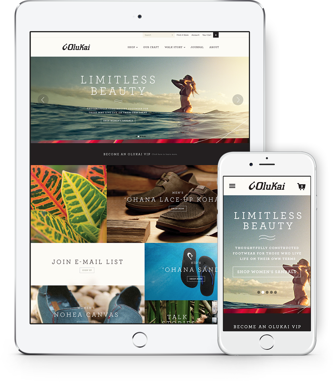
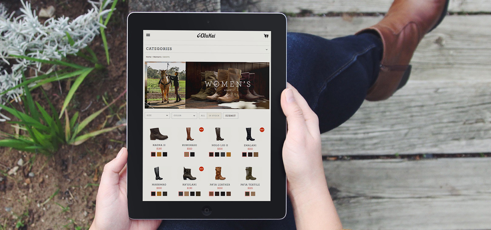
Responsive Mobile website
A major challenge in eCommerce is attempting to replicate the feeling of picking up, holding, and trying on a premium product in an online environment. By developing a user experience that gives prominence to the product itself, using large imagery so that consumers could easily see important details like the rich textures of the materials. Incorporating lifestyle imagery and storytelling to portray the brand story and values behind the product. My role in this project was strictly User experience design.
DESIGN GOALS & OBJECTIVES
- Design a responsive e-commerce website for Olukai, allowing users to browse and purchase with ease.
- Access information about each product a lot easier than the old site allowed.
UX DESIGN & STRATEGY
The site was designed using a modular framework so that each page could be easily customized using the same set of components. This allowed the design team at Olukai to easily curate and populate content for each section of the website while still keeping the design of each page unique and easy to consume. Move the slider left and right to see the UX and final designs.
IDEATION & DESIGN
A sitemap was created combining the flows with user navigation paths for the major areas on the site.
- Purchasing Men's, Woman's, and Children's shoes
- Discovering the Oukai Community and all the content that helps define the brand
- Viewing and purchasing from the collections section of the site

Initially, sketches were made to build variations on the homepage and key pages to establish a basic structure of the layout for web, tablet, and mobile versions. Subsequently, low fidelity wireframes for the web and mobile were created.
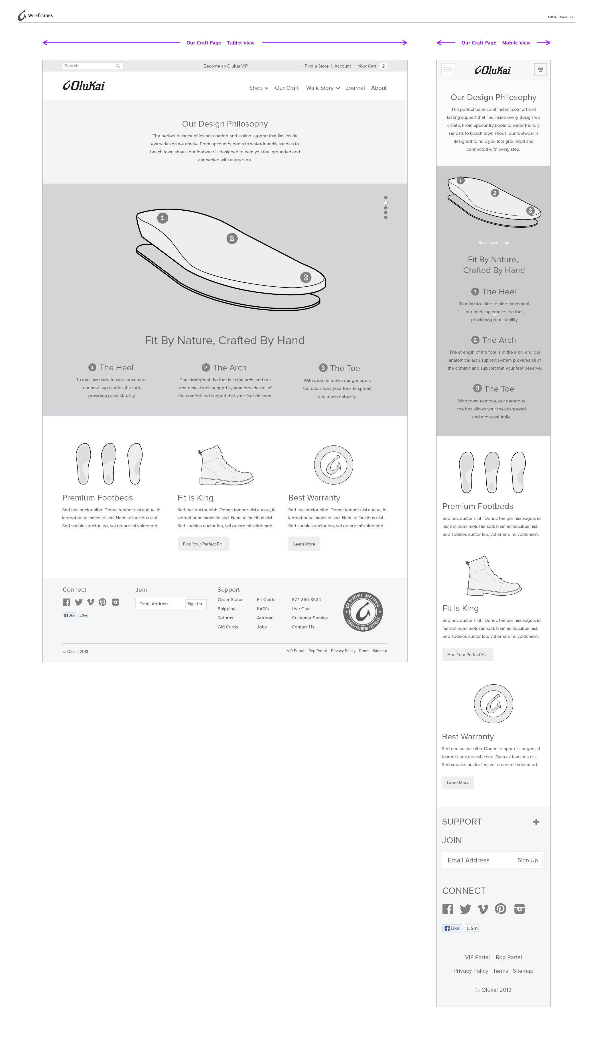
VISUAL DESIGNS APPLIED TO WIREFRAMES
Next, I worked with another Art director and developer to implement the wireframes and make sure the designs aligned with the business goals and our vision.


